Primary Palette
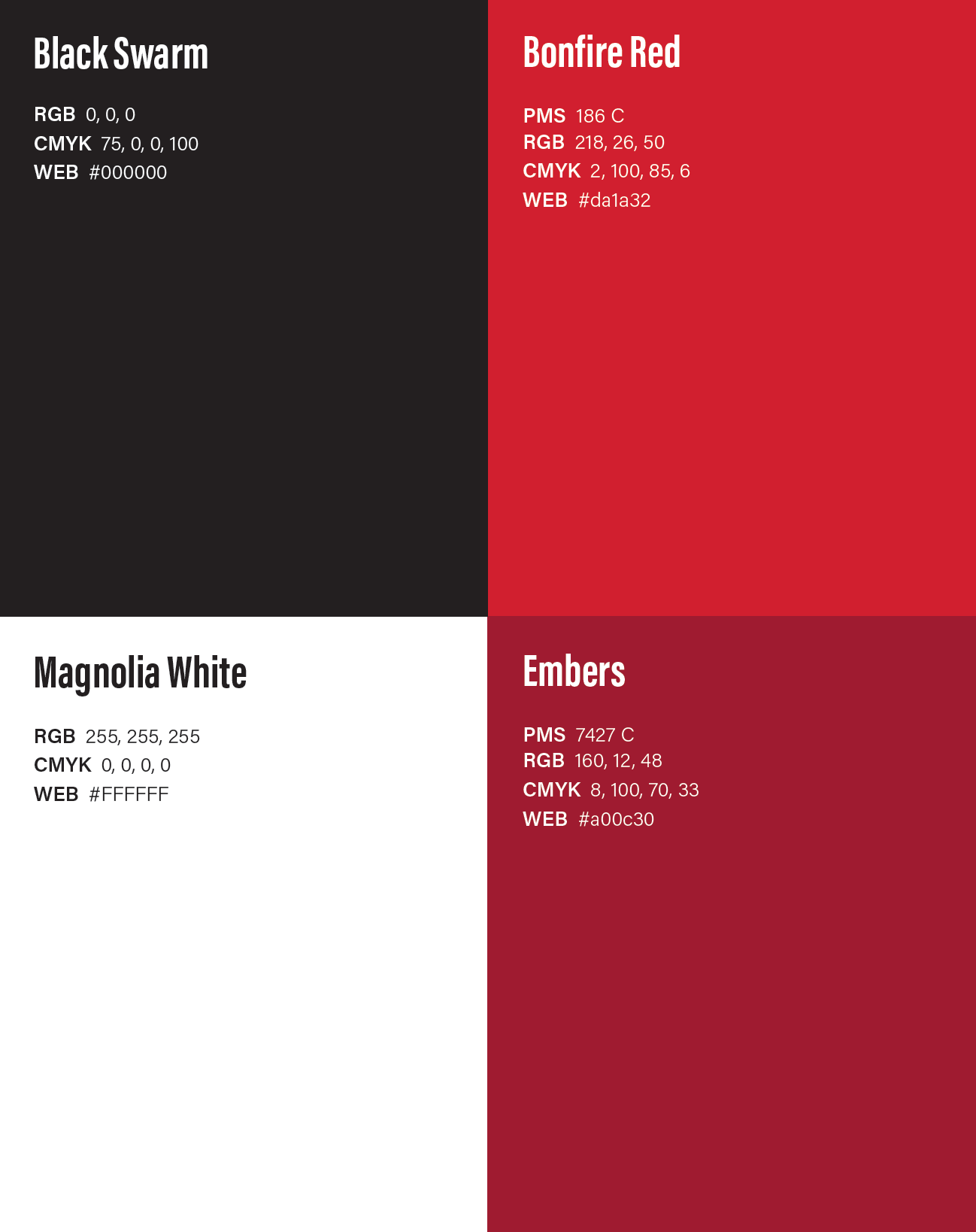

While our brand colors may be used in many different combinations, Black Swarm and Bonfire Red should be dominant throughout any given piece (or series of pieces).
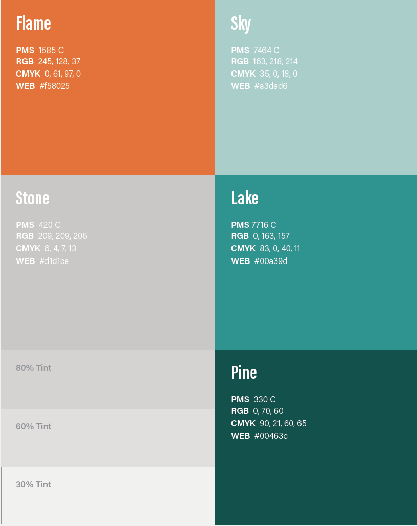
Our secondary color palette is inspired by our distinct South Georgia landscape and should be used sparingly to accent our primary colors.
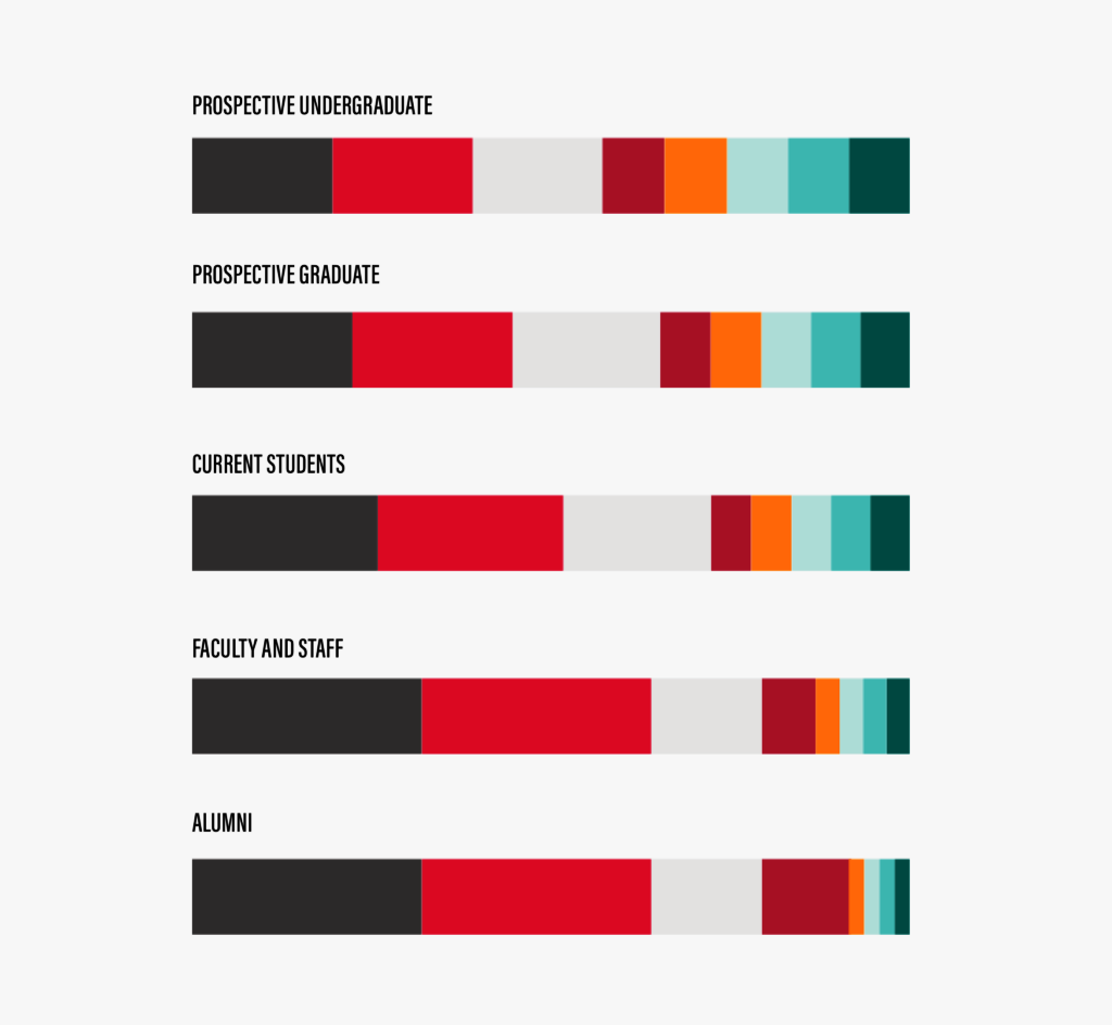
There are a number of different audiences within the Valdosta State community, each with a different association with the brand identity and color palette. Refer to these ratios when creating targeted materials.
Note: The proportions shown here are not a hard and fast rule, but rather a starting point for further exploration.
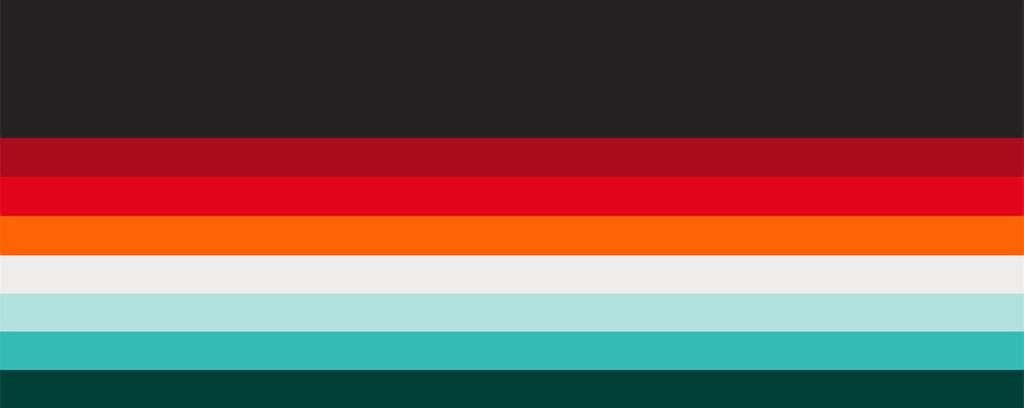
Gradients add depth to our compositions and are an effective way to subtly use our secondary color palette.
Color Gradients

To create a color gradient in InDesign, double-click the gradient icon on the toolbar.

Select “Linear” under gradient type, then click and drag your chosen PMS colors from the swatch panel to the gradient bar (replacing the default black and white).
Gradient Feather

To apply a gradient feather to an object, select the gradient feather icon on the toolbar.

Select the object you would like to apply the effect to, then click and drag the gradient in the direction and length of your choice.
Example of color gradient and gradient feather used together:
